
Staged homes sell faster than unstaged ones – and the single biggest driver isn’t the furniture or the fresh coat of paint. It’s whether the space reads as intentional. That distinction between a room that looks assembled and one that looks designed is something buyers register almost instantly, even when they can’t articulate why. The same principle applies whether you’re selling or staying put: the signals that make a home look expensive aren’t about spending more money. They’re about understanding what the eye and brain respond to.
Perception works in predictable ways. Colors trigger neurological responses. Symmetry reduces cognitive strain. Clutter raises cortisol levels. These aren’t abstract design concepts – they’re measurable physiological reactions, and they explain why two rooms with identical square footage can feel completely different. Making a home look expensive is less about buying new things and more about removing the right things, repositioning others, and being deliberate about a few high-leverage choices.
The 11 changes below are ranked by impact, not cost. Several of them are free. Most of the rest require less than you’d spend on a weekend away. The goal isn’t to make your home look like a showroom – it’s to make it feel like someone with taste lives there.
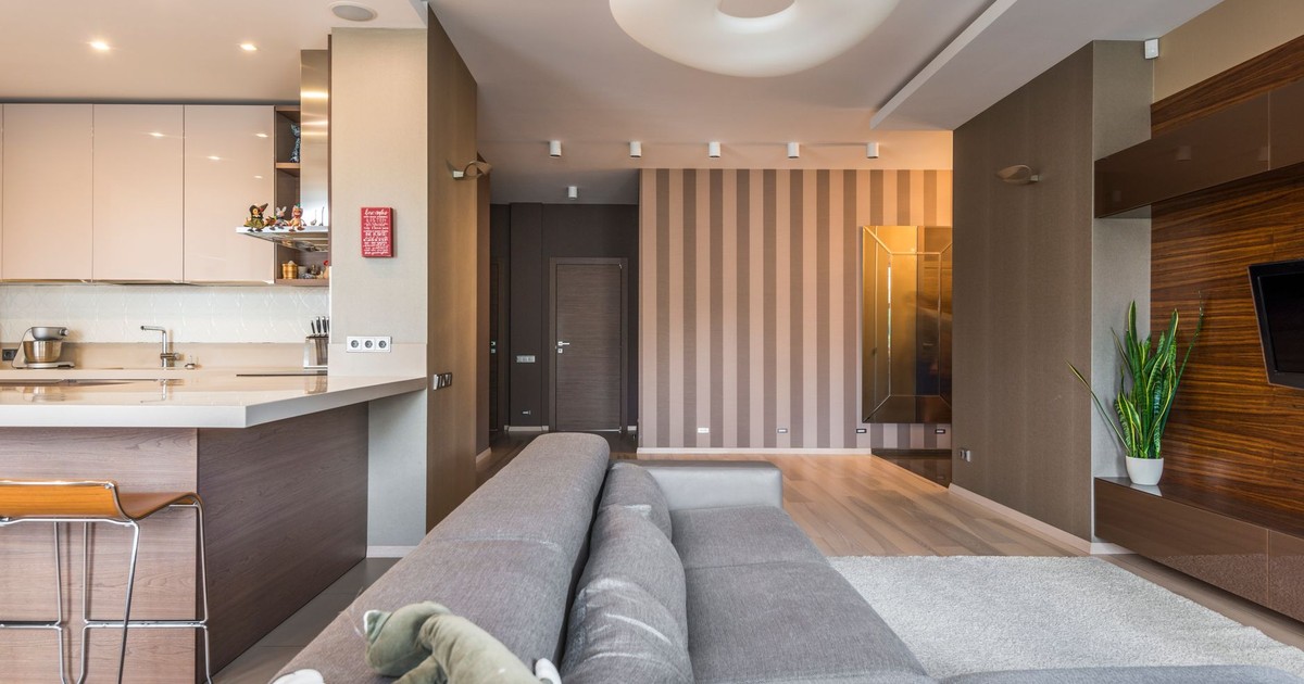
1. Declutter Ruthlessly – Every Surface, Every Room
A 2025 study published in the Journal of Environmental Psychology found that home clutter correlates negatively with psychological well-being – and that effect extends directly to how others perceive the space. A cluttered room doesn’t just feel stressful; it looks cheaper, regardless of what’s in it.
The Rocky Mountain College of Art and Design notes that visual excess competes for attention, increasing cognitive load and cortisol, and that clear zones and limited palettes reduce stimuli so the brain can focus. When someone walks into a room with too much going on, their brain works harder just to process the scene. The space registers as chaotic before a single piece of furniture is evaluated. Research from UCLA’s Center on Everyday Lives and Families found that women in cluttered homes had higher cortisol levels throughout the day compared to those in organized spaces.
Keep surfaces to three objects or fewer. Clear kitchen countertops, bedroom nightstands, and bookshelves down to curated objects only. Decant cleaning products into uniform containers under the sink. Store remotes, chargers, and cables out of sight. What remains will automatically look more deliberate – and deliberate reads as expensive.
2. Upgrade Your Lighting (Starting With Bulbs)
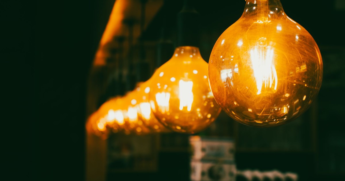
Most homes have mediocre lighting not because of their fixtures but because of their bulbs – cool white LEDs that flatten everything and drain warmth from every surface. According to a study cited by CTO Lighting, sustainable home improvements like energy-efficient lighting can boost property values by up to 23%.
LED bulbs with dimming capabilities and warm color temperatures in the 2,700 – 3,000 Kelvin range are ideal for atmospheric lighting, providing energy efficiency and flexibility in creating mood. Replace every cool-white bulb (5000K and above) with a warm white equivalent in that range. The color rendering immediately makes walls, wood, and fabrics look richer. Layer in a floor lamp or two to eliminate the flat, overhead-only look that makes rooms feel institutional.
If fixture replacement is in budget, prioritize the spaces guests see first: the entry, living room, and dining area. A single statement pendant over a dining table does more for the perceived value of a room than repainting the walls.
3. Use Color Strategically – Not Decoratively
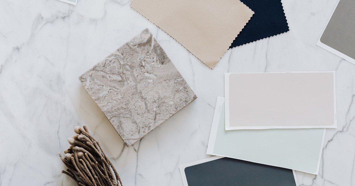
Most people choose paint colors they like. The more useful question is which colors make a space feel considered. Colors trigger neurological responses that can alter heart rate, blood pressure, and hormone levels, and those responses are consistent enough across populations to be predictable. Blue consistently ranks as the most universally attractive color in psychological research – which is why it appears so heavily in high-end hotel lobbies and luxury real estate photography.
Moody interiors read as intentional and confident, increasing memorability and perceived value in a home. Deep navy, forest green, charcoal, and rich terracotta signal designed choices rather than default ones. Applied to a single accent wall, a built-in bookcase, or a kitchen island, a saturated color communicates that someone made a deliberate decision – and that reads as sophistication.
For those who prefer a neutral base, the key is undertone consistency. Warm whites – cream, linen, alabaster – layered with warm wood and brass feel cohesive. Cool whites pair with chrome and slate. Mixing undertones, warm walls with cool furniture, is the single most common reason a room feels “off” without the owner knowing why.
4. Add Natural Texture and Organic Materials
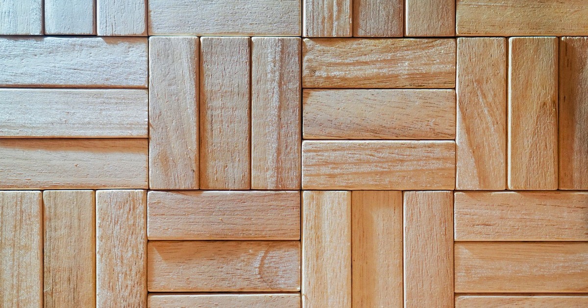
Neuroaesthetic research – the scientific study of how aesthetics affect the brain – shows that natural textures create comfort and emotional connection in ways that synthetic materials don’t replicate. Linen curtains, a jute rug, a rattan side table, or unfinished oak shelving all communicate warmth through material rather than decoration.
Architects across the luxury segment have been returning to natural timber after decades of favoring concrete and steel, precisely because wood carries a material story that resonates without compromising aesthetics. The same principle scales down to everyday interiors – a solid wood coffee table or a timber-framed mirror carries a different visual weight than its MDF equivalent, and most visitors can sense that difference even without knowing why. Natural fiber furniture has been gaining momentum in interior design, driven by a growing preference for sustainability, elegance, and materials that age well rather than date quickly.
Prioritize one or two genuinely natural-material pieces over several cheaper synthetic ones. A single linen sofa outperforms three polyester throw pillows in conveying quality.
5. Create Symmetry in Key Rooms
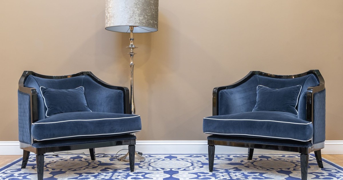
A 2025 study published in PLOS One investigated the impact of symmetry on consumers’ perceived product quality, and found that symmetrical compositions significantly enhance perceived quality, with perceived stability mediating the effect. That finding translates directly from product design to interior spaces. Symmetry creates a sense of order and predictability that the brain finds reassuring, and rooms that satisfy that response are consistently rated as more attractive and higher-value.
You don’t need to redesign the room. Match the lamps on either side of a bed. Place identical plants flanking a fireplace. Mirror the art arrangement on opposing walls in a hallway. Even partial symmetry – one balanced vignette in an otherwise mixed room – anchors the space and communicates intentionality.
The living room and bedroom yield the most return from this approach because they’re the spaces where perceived quality matters most to both residents and guests.
6. Stage Your Spaces Like a Buyer Would See Them
According to the National Association of Realtors’ 2025 Profile of Home Staging, 29% of real estate agents reported that staging their sellers’ homes received a 1% to 10% increase in the dollar value offered, and 30% of home sellers’ agents observed a decrease in time on the market when homes were staged.
The same NAR report found that 83% of buyers’ agents said staging a home made it easier for a buyer to visualize the property as a future home. That visualization gap exists when guests or visitors enter your home, too. The staging principle – clearing personal clutter, editing furniture to the essentials, adding one intentional focal point per room – applies whether or not you’re selling. Practically: remove at least 30% of the furniture in any room that feels crowded. Create a clear sightline from the doorway to a focal point – a fireplace, a piece of art, a window. Let the room breathe.
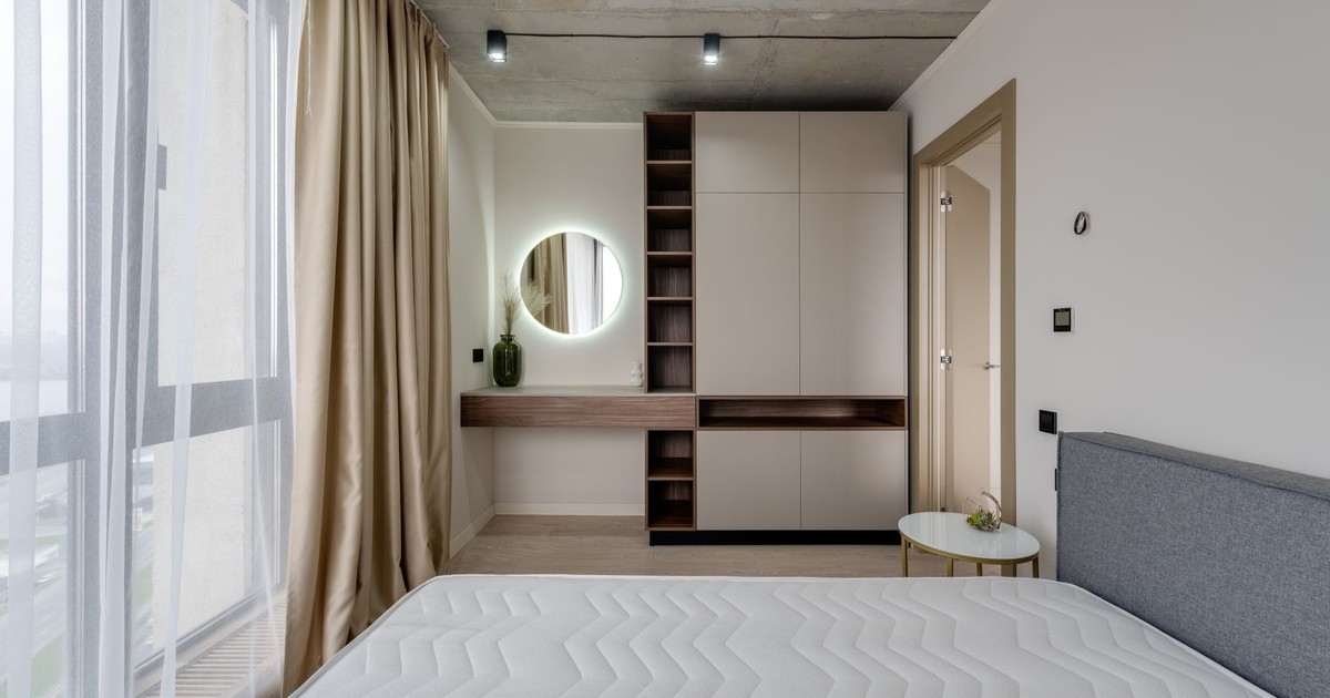
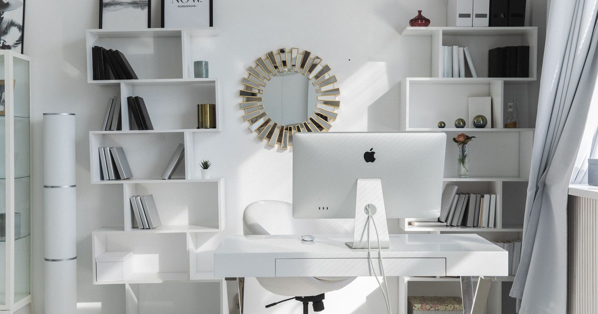
7. Introduce a Statement Mirror
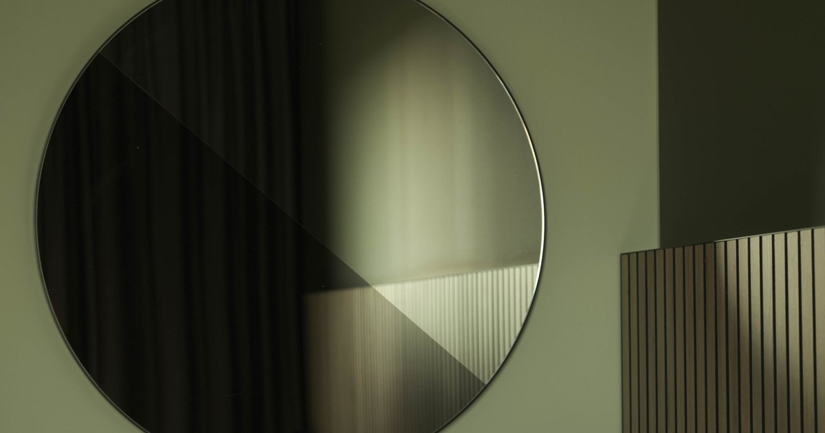
Mirrors do two things simultaneously: they extend light and they suggest scale. A large, well-framed mirror in a smaller room creates the perception of more space – a technique used in every boutique hotel and high-end retail environment. The frame matters as much as the glass. Thick wood, brushed brass, or arched stone-effect frames communicate material quality in a way that thin metal trim never does.
Placement determines effectiveness. Positioned across from a window, a mirror bounces natural light deep into the room. Hung in an entry hallway, it extends a narrow space and creates a moment of arrival. Leaning a large mirror against a wall rather than hanging it reads as intentional and relaxed – a styling choice rather than a storage solution – which tends to register as more expensive than a formally hung frame.
You might also want to explore how scent works alongside visual design to shape first impressions – the two cues compound each other in ways that visual upgrades alone can’t replicate.
8. Layer Your Window Treatments
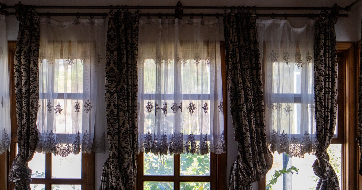
Bare windows or thin roller blinds are one of the fastest tells that a room isn’t finished. Layered window treatments – a sheer panel behind a heavier linen or velvet curtain – create depth and softness that reads immediately as considered design. Hanging curtain rods at ceiling height, even in rooms with low ceilings, draws the eye upward and makes the wall feel taller. Panels that pool slightly on the floor reinforce that vertical effect.
Current design trend data shows that homebuyers prioritize neutral design, functional layouts, and natural light – and layered window treatments serve all three at once. Sheer underlayers let light filter in while softening it; heavier outer panels add thermal mass and reduce echo. In terms of material, linen and cotton read as higher quality than polyester at a fraction of the price of silk – and age better.
9. Curate, Don’t Collect
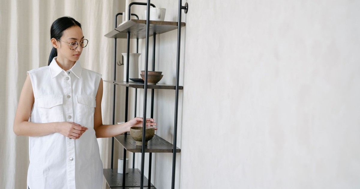
The difference between a home that looks expensive and one that looks busy often comes down to the ratio of objects to space. Expensive homes tend to have fewer things, each placed with intention. The vignette – a small, carefully arranged grouping of objects on a shelf, tray, or table – is the unit of composition that high-end designers work with. Three objects of varying heights, in a coherent color palette, with one natural element such as a plant, a stone, or a piece of wood, consistently reads as styled rather than accumulated.
Art deserves specific attention here. A single large canvas reads as more intentional than a cluster of small frames. A 2025 systematic review published in PLOS One examining environmental art across healthcare and public spaces found that improved sense of well-being was among the most frequently reported outcomes, with a systematic review of visual aspects in hospital environments showing strong associations between art and positive outcomes. Art isn’t merely decorative – it actively shapes how a space feels. If gallery walls are your preference, stick to a consistent mat color and frame finish to hold the composition together visually.
10. Choose Warm, Layered Minimalism Over Sterile White
Current design trends show that homebuyers are prioritizing warm-toned, personality-driven interiors – a deliberate departure from the cold, all-white aesthetic that dominated the 2010s. Sterile white rooms now read as unfinished rather than modern. Warm minimalism – a neutral base punctuated by natural materials, a plant or two, and one or two saturated accents – hits the same clean notes without feeling clinical.
The layering principle applies to every surface category. On floors: a textured rug over hardwood rather than a plain flat weave. On seating: a linen throw over a neutral sofa rather than nothing. On shelves: books with their spines turned outward in a consistent color direction, mixed with one or two sculptural objects. Each layer adds tactile and visual richness without adding visual noise – and that combination is what the brain registers as quality.
11. Elevate the Entry – It Sets Every First Impression
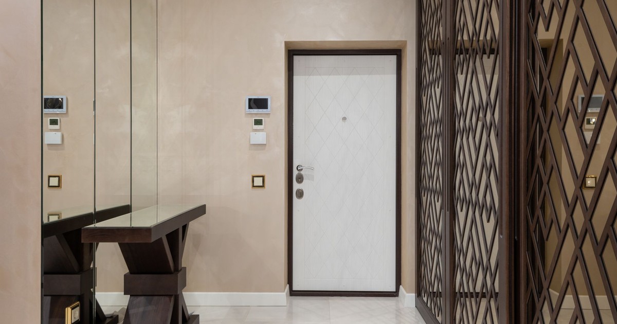
The entry is the frame through which every visitor reads the rest of the home. A well-designed entry that takes thirty seconds to process raises the perceived value of everything beyond it. A cramped, cluttered, or featureless entry depresses expectations that furniture and finishes in the main rooms then have to work against.
According to the National Association of Realtors’ 2025 Profile of Home Staging, 30% of home sellers’ agents observed a decrease in time on market when homes were staged, with living rooms cited as the most important space for buyers, followed by the primary bedroom and kitchen. The entry compounds all of it. A narrow console or bench, one mirror to expand the space, one light source warmer than the ambient light outdoors, and nothing on the floor that doesn’t belong – that formula is enough. A single plant or a small collection of objects on the console completes the composition. Guests don’t consciously analyze any of this – they walk in and feel like the home is looked after. That feeling sets the tone for everything that follows.
Read More: How to Make Your Home Smell Amazing Naturally
What to Do Now
Making a home look expensive is almost always a subtraction problem before it’s an addition problem. Remove what competes for attention, correct the lighting temperature, establish symmetry in at least one key room, and let the space breathe. Those four moves alone – all low-cost or free – account for the majority of the gap between a room that reads as polished and one that doesn’t.
From there, each intentional addition compounds the effect: a natural-material statement piece, layered window treatments, a curated entry. The sequence matters because each change improves the canvas that the next one builds on. Start with the declutter, fix the lighting, then add. That order produces a result that looks like a design budget three times what you actually spent.
Read More: 8 Simple and Cheap Ways To Deal With Cockroaches in Your Home
Disclaimer: This information is not intended to be a substitute for professional medical advice, diagnosis, or treatment and is for information only. Always seek the advice of your physician or another qualified health provider with any questions about your medical condition and/or current medication. Do not disregard professional medical advice or delay seeking advice or treatment because of something you have read here.
AI Disclaimer: This article was created with the assistance of AI tools and reviewed by a human editor.