
No matter how long a company has been in business for, and no matter how “iconic” their logo, imagery, or marketing has been, there is always room for positive change. Popular cheese and butter company Land O’ Lakes is proving this with the recent announcement of a logo change leading up to their 100 year anniversary. (1, 2)
Out With the Old, in With the Progressive
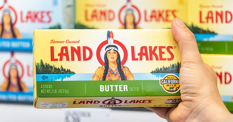
For nearly 100 years, an image of a Native American woman has adorned the packaging of Land O’Lakes products. The farmer-owned cooperative founded in Minnesota in 1921 has recently announced that consumers will no longer be seeing this image on their products. Instead, there will be pictures of their farmers, with the words “farmer-owned” above the logo and “since 1921” below. (1, 2)
According to Beth Ford, president, and CEO of Land O’Lakes, this new packaging will better reflect the values and foundation of their company. (1, 2)
“As Land O’Lakes looks toward our 100th anniversary, we’ve recognized we need packaging that reflects the foundation and heart of our company culture—and nothing does that better than our farmer-owners whose milk is used to produce Land O’Lakes’ dairy products,” Ford said in a press release. “As a farmer-owned co-op, we strongly feel the need to better connect the men and women who grow our food with those who consume it.” (2)
The new logo is set to be fully rolled-out by the end of 2020.
A Celebrated Decision
In recent years, the company has come under fire for its logo. The imagery of a Native American woman has been called racist by activists and other supporters of Native American rights. The use of it promotes stereotypes and that Native Americans are mascots as opposed to real people who are very much a part of modern society. This has a negative impact on the self-esteem of Native American people, especially children. (1)
Chief executive of the National Congress of American Indians Kevin Allis told the New York Times that he is pleased with the change, and wants to encourage other companies with this type of imagery to follow Land O’Lakes lead. (1)
“Americans need to learn the truth about the beauty and diversity of tribal nations, peoples and cultures today and discarding antiquated symbols like this are a step in the right direction.” (1)
Though the company has not made any statements about the removal of the original logo in regards to its connection with racism and unfair stereotyping towards Native American people, it is being celebrated in this way regardless. (1)
The origin of the logo
The original logo was designed by an artist who worked for an advertising firm named Arthur C. Hanson in 1928. Thirty years later, it was redesigned by Chippewa artist Patrick DesJarlait. According to DesJarlait’s son Robert, his father touched up her features and redesigned her dress to reflect Chippewa culture. Though Robert doesn’t feel as though the Land O’Lakes woman was designed to be a stereotype or harmful, he understands why many Chippewa and other Native American people were uncomfortable with the logo. He agrees that the company made the right decision. (1)
The Bottom Line
Land O’Lakes decision to change their century-old logo will have a positive ripple-effect for so many people. It promotes the correction of the harmful and racist narrative that has plagued the indigenous populations of America for generations. It brings attention to the farmers who work hard every day so that millions of Americans can have food on the tables. Lastly, it shows not only how businesses and corporations can have a big influence on the normalization of harmful stereotypes, but also that they have the power to make positive change and use their influence for good.